unwritten poem infuses their packaging with poetic purpose
Written by Chloe Gordon
19. 07. 2021.

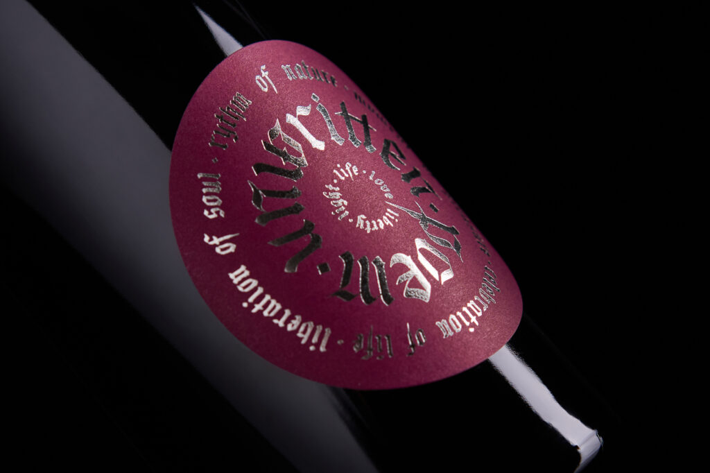
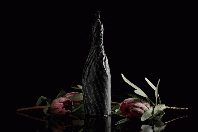
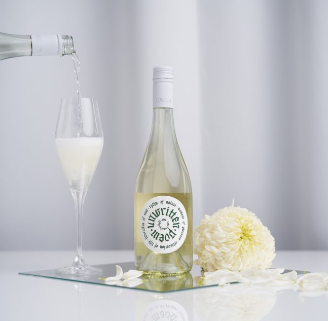
The wines from Tiwari House are only released after extensive development in the cellars and once they embody an impeccable balance. Because of the brand’s quest to understanding the connection between humans and nature, designer Kira Koroknai created a packaging design that infused the bottles with the same poetic force and determination. Handcrafted calligraphy paired with a circular design creates an effect that feels both whole and wholesome. Not to mention the colour hues used throughout the packaging create a youthful aesthetic, perfect for a brand that’s based on the timing, in the way of growth, life, and experience.

Winery:
Tiwari House is a combination of a wine estate, a state-of-the-art Winery, a research center, tasting/judging lounges, and a visitor’s center overlooking the landscape of volcanic hills, national parks, and Lake Balaton. The House functions as a center for Hungarian wine excellence and discovery, with grape production, education, winemaking, and wine tasting at its heart. Tiwari House is the vintage wine only. Each vintage is a creation, singular and unique, that captures memories and expresses both the character of the year and the character of Tiwari House. The wines are released only after extensive elaboration in the cellars when they embody the perfect balance, their signature, and be worthy of Tiwari House cuveé.
Philosophy:
Intricate dynamic nexus of winemaking with nature-inspired a quest to understand meaning and relationships between inseparably connected nature and human nature. Although at first, this appears to be at random, the rhythm of nature actually takes place based on universal principles that dictate balance and imbalance, rise and fall, movement and standstill, daylight and darkness, induced by the spiral of life. A curious richness, so full of harmony, that breaks at every moment into eternal pleasure, that ties emotional, physical, and spiritual intimacy, had to be channeled for the ultimate celebration of life. It’s the progression of a relationship, a dialogue liberating soul, and the beauty which they felt, a medium is created for ones to find their relationship with that of writing a poem.

Branding:
Unwritten Poem visualisation is infusing poetry with applied art for the unforgettable all-round sensory experience. Decorated with handcrafted calligraphy, which represents thousands of years of old multifaceted artistic tradition, the wine brand label blends poetry with positive philosophical reference words and the innovations of digital technology. The label reflects freshness and the youthfulness, while demonstrating elegance with a punchy edge through aesthetic display.
Read the full article on the popular branding blog, the Dieline: https://thedieline.com/blog/2021/7/19/unwritten-poem?


